Orage Rebranding
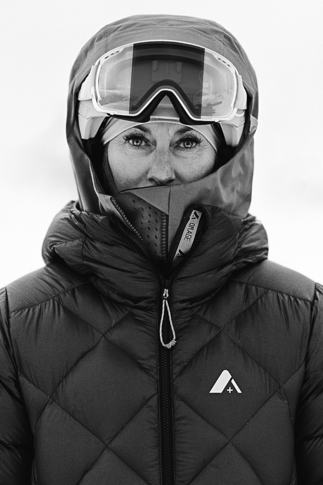
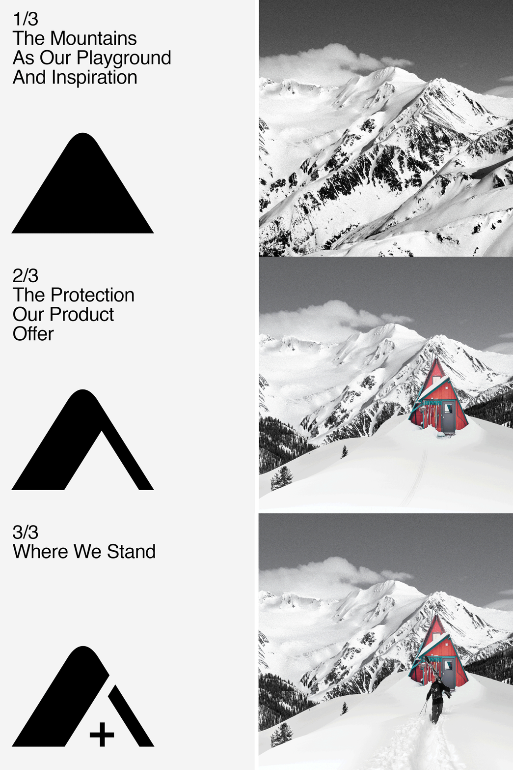
Orage evolved so much over the last few years, it was time to mark the new era. Born from a passion for skiing and a love of the mountains, Orage always blurred the lines between technical outerwear and street fashion. The logo we designed needed to represent the Orage playground and where they draw their inspiration. It showcases the protection that their products offer in that environment, while displaying their unique positioning in the ski world.


Old Logo

New Logo
The old logo had so many different elements which limited the possibilities in terms of creativity and design. By simplifying the logo we have improved not only its reading and the recognition of the brand but also its versatility. This allows us greater creative latitude in product and marketing. Through its clean and minimal signature the logo is a reflection of Orage’s creative vision.


